
Manage your listing
Follow a step-by-step guide with online chat support to create or manage your listing.
Community


Let’s talk

Dana Stanley
Greenbook’s Chief Revenue Officer
Categories
Research Methodologies
July 26, 2017
Using Bubble Charts to Show Significant Relationships in Correspondence Analysis
Learn how to utilize bubble charts for clear data visualization in correspondence analysis.
by Tim Bock
0
 While correspondence analysis does a great job at highlighting relationships in large tables, a practical problem is that correspondence analysis only shows the strongest relationships, and sometimes some of the weaker relationships may be of more interest. One of our users (thanks Katie at JWT!) suggested a solution to this: format the chart to highlight key aspects in the data (e.g., standardized residuals).
Case study: travelers’ concerns about Egypt
The table below shows American travelers’ concerns about different countries (I have analyzed this before in my Palm Trees post). There is too much going on with this table for it to be easy to understand. I have used arrows and colors to highlight interesting patterns based on the standardized residuals, but too many things are highlighted for this to be particularly helpful. This is the classic type of table where correspondence analysis is perfect.
The correspondence analysis of the data is shown below. The two dimensions explain 93% of the variance, which tells us that the map shows the main relationships. However, the map is not doing a good job of explaining the relationships between Egypt and China and the concerns of travelers. Both countries are close to the center of the map. Adding more information to the visualization can enhance it further. In the rest of the post I focus on improving the view of Egypt.

Plotting positive standardized residuals
The standardized residuals are shown below. Remembering that positive numbers indicate a positive correlation between the row and column categories, we can see that there are a few “positive” relationships for Egypt, with Safety being the strongest relationship. As the data is about travelers’ concerns, a positive residual indicates a negative issue for Egypt.
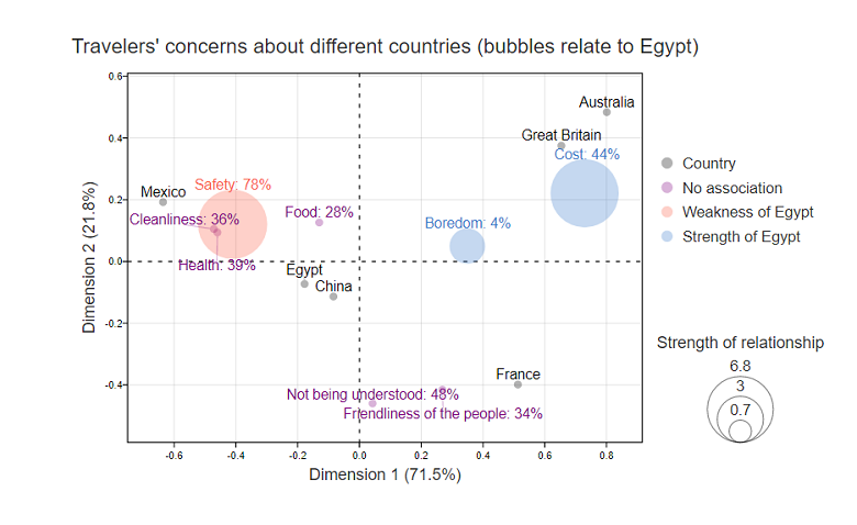
Bubbles represent the positive standardized residuals in the plot below. The area of the bubble reveals the strength of the association of the concern with Egypt. This is a lot easier to digest than the residuals. We can easily see that “Safety” stands out as the greatest concern. “Not being understood” and “Friendliness”, the next most important issues, appear trivial relative to “Safety”.
 Adding the raw data to the chart
A limitation of plotting standardized residuals is that they show the strength of association, which can be misinterpreted if there are attributes in the analysis that are widely held or obscure. A simple remedy is to plot the raw data for the brand of interest in the labels. This clears up a likely misinterpretation encouraged by all the earlier charts. You can interpret the previous visualizations as implying a lack of relationship between “Cost” and Egypt. However, 44% of people evidently show concern about the cost of visiting Egypt. There exists, however, no positive correlation because they are much more concerned about the costs with the European countries (you can see this by looking at the original data table, earlier in the post).
 Showing positive and negative relationships
The following visualization also shows the negative standardized residuals, drawing the circles in proportion to their absolute values. Blue represents the negative residuals, and the pink color the positive ones. In a more common application, where the correspondence analysis is of positive brand associations, reversing this color-coding would be appropriate.
 Showing only significant relationships
The final visualization below shows only the significant associations with Egypt. I think it is the best of the visualizations in this post! If you are wanting to understand the data as it relates to Egypt, this is much more compelling than the original data. We can quickly see that “Cost” represents a comparative advantage, and that Egypt shares its main weaknesses with Mexico. If you want to encourage visitors to Egypt, then you could consider positioning it as a competitor to Mexico. (This data comes from a survey done in 2012, and thus potentially constitutes a poor guide to the market’s mind today.)
 Software
To see the underlying R code used to create the visualizations in this post, click here, login to Displayr and open the relevant document. You can click on any of the visualizations in Displayr and select Properties > R CODE in the Object Inspector to see the underlying code.
I have also written other posts that describe how to create these visualizations and the differences in the R code between the plots. One of them describes how to create these visualizations in Displayr, and another describing how to do it in Q.
Disclaimer
The views, opinions, data, and methodologies expressed above are those of the contributor(s) and do not necessarily reflect or represent the official policies, positions, or beliefs of Greenbook.
Comments
Comments are moderated to ensure respect towards the author and to prevent spam or self-promotion. Your comment may be edited, rejected, or approved based on these criteria. By commenting, you accept these terms and take responsibility for your contributions.
More from Tim Bock
Research Methodologies
Rotate Your Correspondence Analysis to Better Understand Your Brand Positioning
Tim Bock on utilizing correspondence analysis.
Tim Bock
Research Methodologies
Data Visualization for Conjoint Analysis
Visualizations can summarize patterns that are commonly hidden in a simulator
Tim Bock
What’s Better Than Two Pie Charts?
Bad visuals stress the need for charts to be interpretable in seconds
Tim Bock
Insights Industry News
Using “Small Multiples” Visualizations for Big Success
Visualizing data can be made easier by utilizing small charts for comparison and analysis
Tim Bock
ARTICLES
Top in Quantitative Research
Research Methodologies
Moving Away from a Narcissistic Market Research Model
Why are we still measuring brand loyalty? It isn’t something that naturally comes up with consumers, who rarely think about brand first, if at all. Ma...
Devora Rogers
Chief Strategy Officer at Alter Agents
Qualitative Research
The Stepping Stones of Innovation: Navigating Failure and Empathy with Carol Fitzgerald
Natalie Pusch
Senior Content Producer at Greenbook
Sign Up for
Updates
Get content that matters, written by top insights industry experts, delivered right to your inbox.
67k+ subscribers